FundOps Redesign
Improving the decision-making process for insurance underwriters.
LCI Worker's Compensation is an insurance fund in Louisiana that provides coverage for over 4000 small to medium-sized Louisiana businesses. As part of my SYS 4024 class — User Experience Design (for Systems Engineers) — we spent the semester working with real clients to help them with their UX design needs. I worked with a group of my peers to redesign the online portal that insurance underwriters at LCI use, called FundOps.
Feb - April 2020 (8 weeks)
LCI's underwriters are involved in deciding whether or not they should write a policy for worker's compensation for new and returning businesses. The main decision this involves is deciding how risky it would be to provide worker's compensation insurance to a certain business. These are some of the factors that go into this decision:
The goal of the underwriters at LCI is convert as many "good" applicants into members as possible and keep their overall losses low. In order to do this, they must keep track of submissions and analyze businesses' data using a web app called FundOps. However, FundOps was poorly structured for the underwriters' workflow, making it difficult for them to do their job. They often developed workarounds, like exporting data from FundOps to analyze elsewhere, and used a daily email report to keep track of new submissions.
Modernize and restructure FundOps in a way that provides LCI with a better hierarchical understanding of their data and the information it can provide.
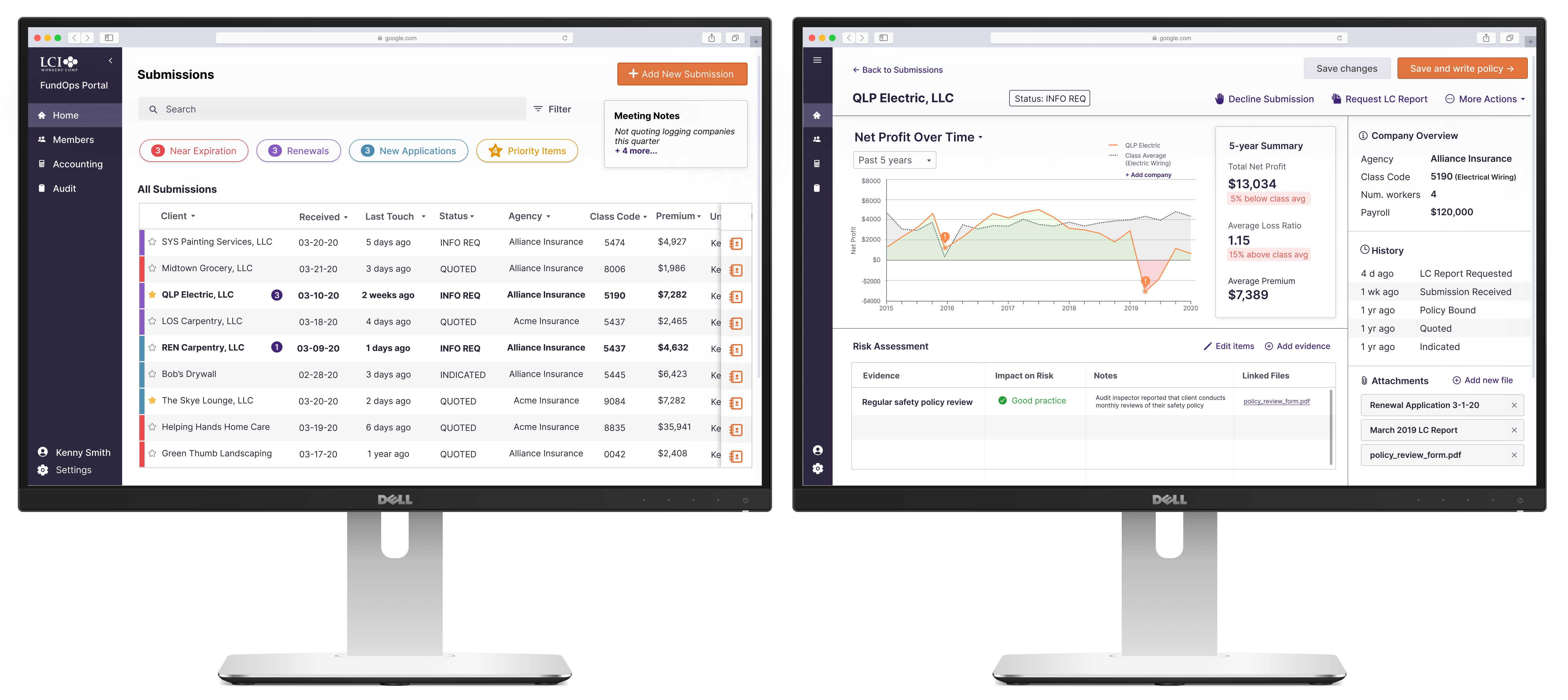
We discovered from a user interview that LCI underwriters all work with two monitors, but one of their biggest frustrations is that FundOps only works in one window at a time. The dual monitor setup allows for underwriters to simultaneously view submissions, complete risk assessment tasks, and write insurance policies.
.gif)
.gif)
.gif)
%20(4).png)
.png)
After presenting to the client, the client and the whole class voted on which project was the best, and our project was voted 1st place, by both the client and the class. We were told that our designs were exactly what the client had envisioned for every step of the process.
So...how did we get there?
The underwriters at LCI Worker's Compensation go through several submissions from insurance agencies each day to decide which companies they can write a policy for, and which companies are too risky to take on.
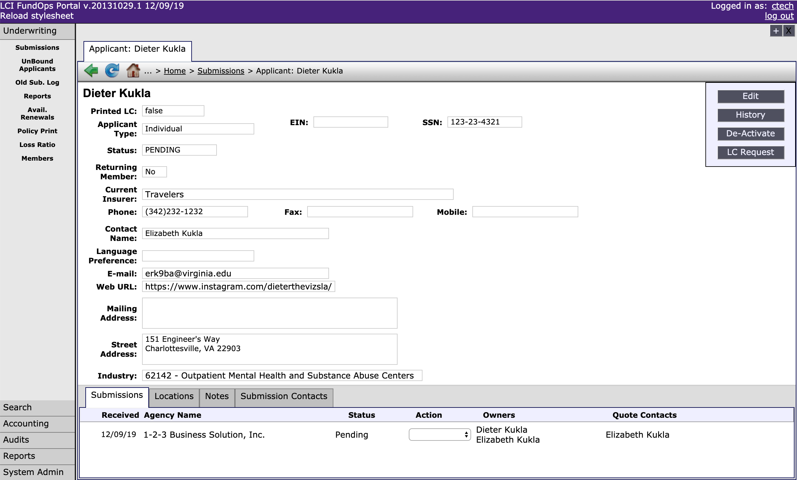
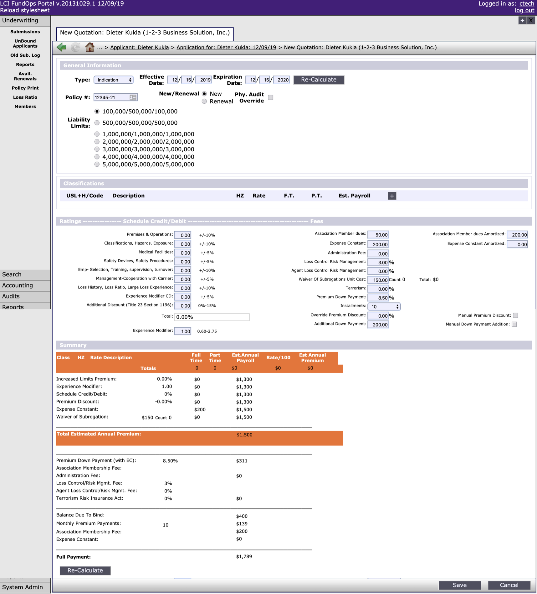
FundOps, their current policy management system, is an outdated portal that isn't optimized for their workflow. For example, it's impossible to filter through the applications for worker's compensation without knowing the specific name of the applicant. FundOps is intended to organize submissions (worker's comp insurance applications) and take actions on them, such as requesting an audit report on a company, creating an insurance quote, and checking a company's loss ratio.
LCI asked us to modernize and restructure the system to provide underwriters with a better hierarchical understanding of their data, allow them to keep track of incoming submissions, and maintain a clear understanding of risk vs. reward on different policies.
Given that we were unfamiliar with the underwriting process, we started by analyzing the problem space and diagramming the system flow. Each color represents a different phase, and the red text represents questions that are caused by pain points in FundOps.
.png)
From there, we had an idea of how the system would need to be restructured, as well as some gaps in our understanding that we would have to follow up on with a user interview:
There are six underwriters working at LCI, and we were able to interview one of them. We learned a few insights from him that guided our final list of design requirements.
Kenny has been working with LCI as an underwriter for 5 years. He has an established workflow using his dual-monitor setup, and is able to complete his job efficiently because of his experience underwriting different types of companies.
From there, we finalized the design requirements of the system, mapping them to all the pain points discussed with the client and the user.
Underwriters get a single email each morning with all the submission statuses, but can't track these submissions in the FundOps system.
Assess relative urgency and work need of available submissions and active policies nearing renewal to choose a submission to work.
Underwriters need to be able to assess the reward of potentially larger policy premiums associated with riskier industries.
Tune premium offer to maintain competitiveness with coverage offers from other companies for the classes of work in a given submission
Underwriters can't easily pull up past audit reports and policies to inform their decisions.
Identify likely sources of risk for the classes of work in a given submission.
Underwriters can't compare a company with its entire class, which is often necessary to make an informed assessment.
Assess the cumulative risk implications of loss control report findings and other evidence for a given submission (i.e.,“Together, does what I know about this company make them a heavier or lighter risk than other companies in the same class?”)
We started sketching, then created rough wireframes for the first iteration of our design. We then presented the designs to other groups for a design review. Here is some of the feedback we received on these designs:
This screen allows underwriters to find submissions and prioritize them easily. The top section allows them to filter out the submissions while also seeing how many of each type they have.
Feedback

Clarify the relationship between summary boxes at the top and the submissions list
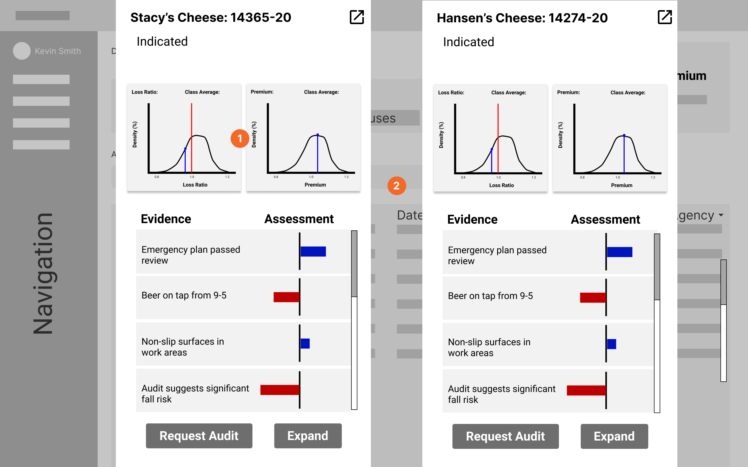
This screen allows underwriters to compare different companies side-by-side. The visuals were meant to aid the decision-making process. We received feedback that this would be too confusing, and we should be doing more work for the user.
Feedback
Distribution graph is overly complicated

Consider merging representations across distribution and assessment stuff — you should do the comparison for the user
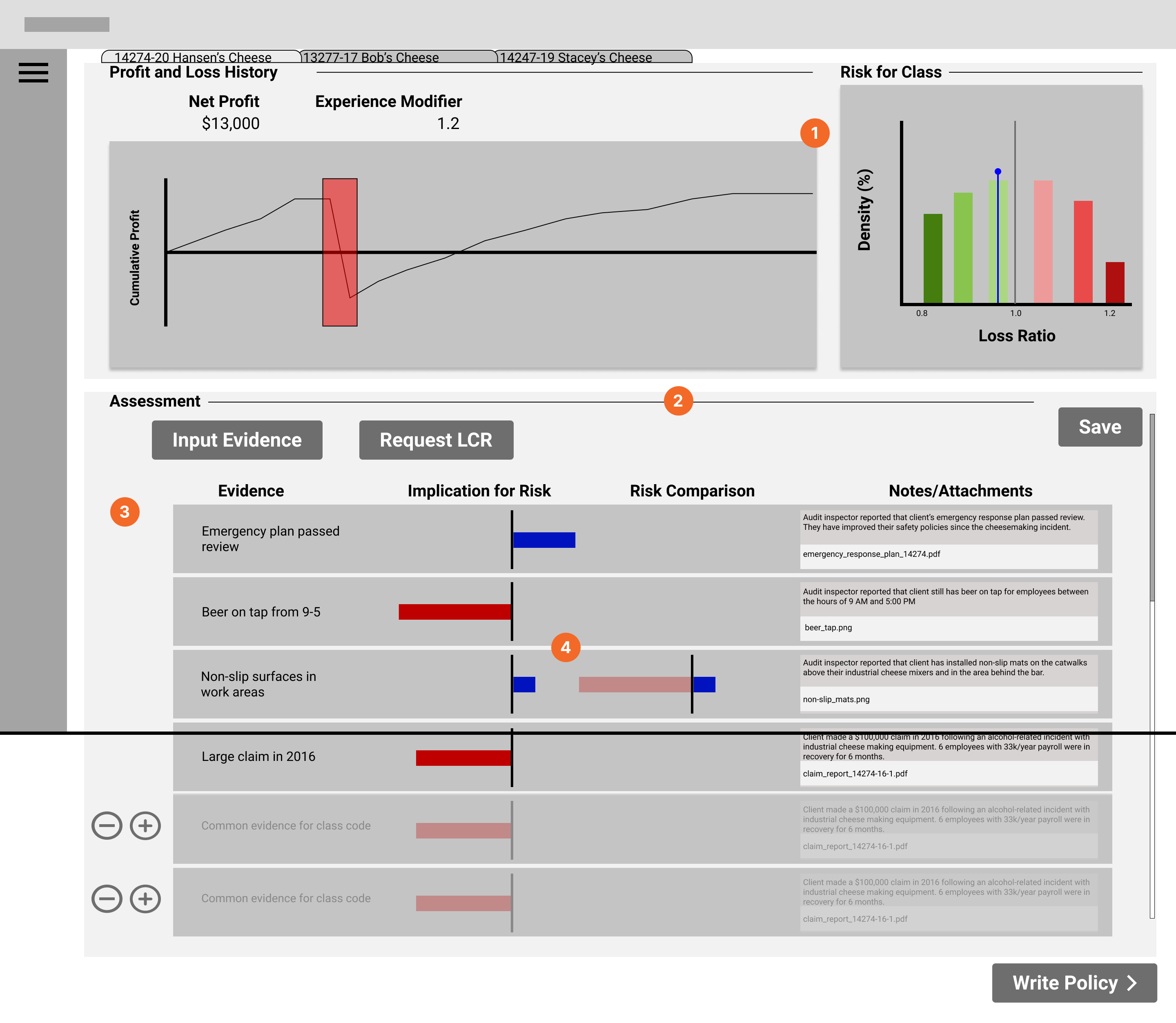
This screen addresses the goal of allowing underwriters to assess cumulative risk and loss reports. The graphs at the top show the company's loss history over time on the left, then how they compare to their class (e.g. construction, plumbing, etc) on the right. The bottom shows items that might have risk implications, such as dangerous work practices.
Feedback
A lot of different data visualizations; every one of those things you need to learn, and it could be tedious to learn
How might you streamline the process for submissions that don't require a lot of decision-making?

How are these items added into the system?

Risk assessment bars might be too low-level for the underwriter to look at; can't discern the differences between bars
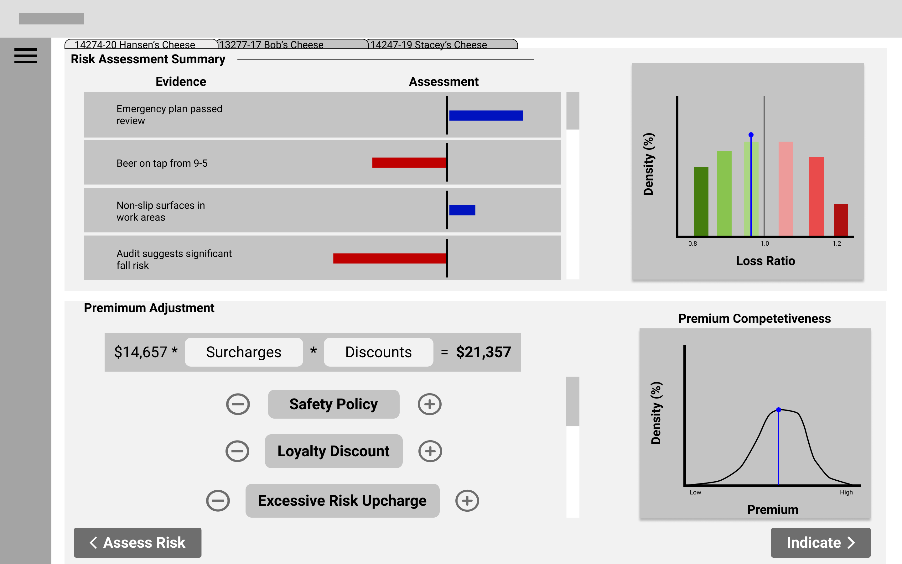
This screen allows underwriters to view important data visualizations and use these to tune the insurance premiums. The top two graphs are for reference, from the previous screen. Since underwriters need to adjust surcharges and discounts based on things like safety ratings, we thought it would be useful to include the risk assessment graphs. The graph on the bottom right uses data from other insurance companies to determine if the premium is competitive.
Feedback
Identify crucial summary information from plots, and maybe summarize on another page
Show context — show effects on long term profitability in addition to competitiveness
Overall, we were told that we had too many different types of visualizations, and that our system needed to consider what would make the underwriters more efficient without confusing them. We needed to think about how to make the underwriters' day-to-day easier, instead of focusing too much on edge cases. We were also told that it would be a good idea to summarize information-heavy areas, effectively doing the analysis work for the underwriters, instead of just giving them a lot of new information to analyze.
After our class critique session, we moved to high-fidelity design, and I took a more prominent leadership role in the group. I created the style guide for our designs and created the initial high-fidelity design for all the screens.
.png)
Here are some of the iterations my designs went through, with feedback from my group:
Feedback:
Feedback:
.png)
Changes:
Feedback:
Feedback:
.png)
Changes:
Here are the final designs, as well as some explanations for why I designed them the way I did.
We discovered from a user interview that LCI underwriters all work with two monitors, but one of their biggest frustrations is that FundOps only works in one window at a time. The dual monitor setup allows for underwriters to view different parts of FundOps at the same time.
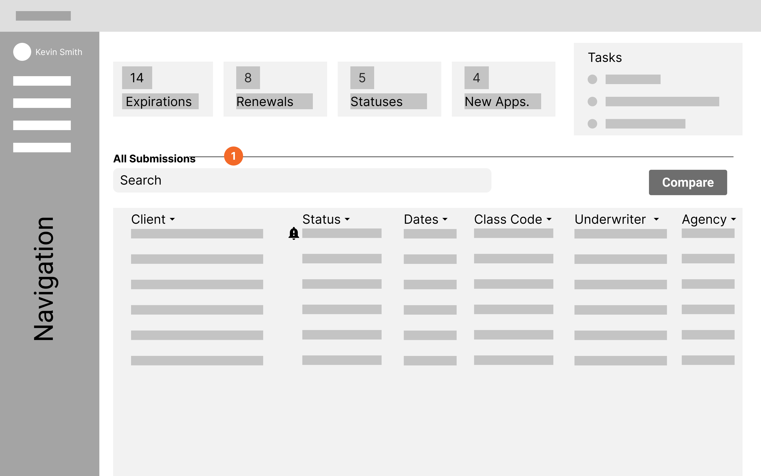
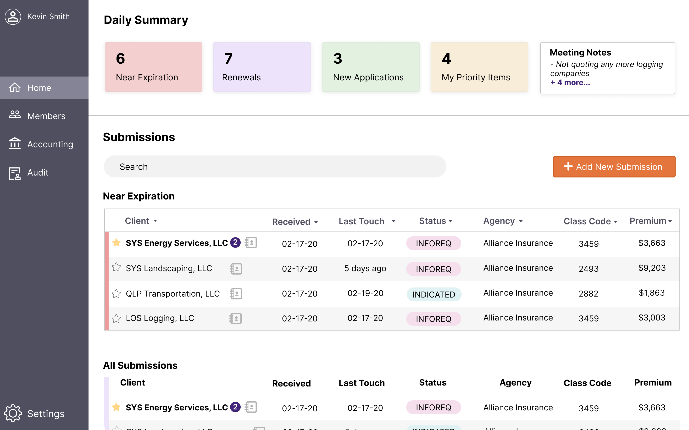
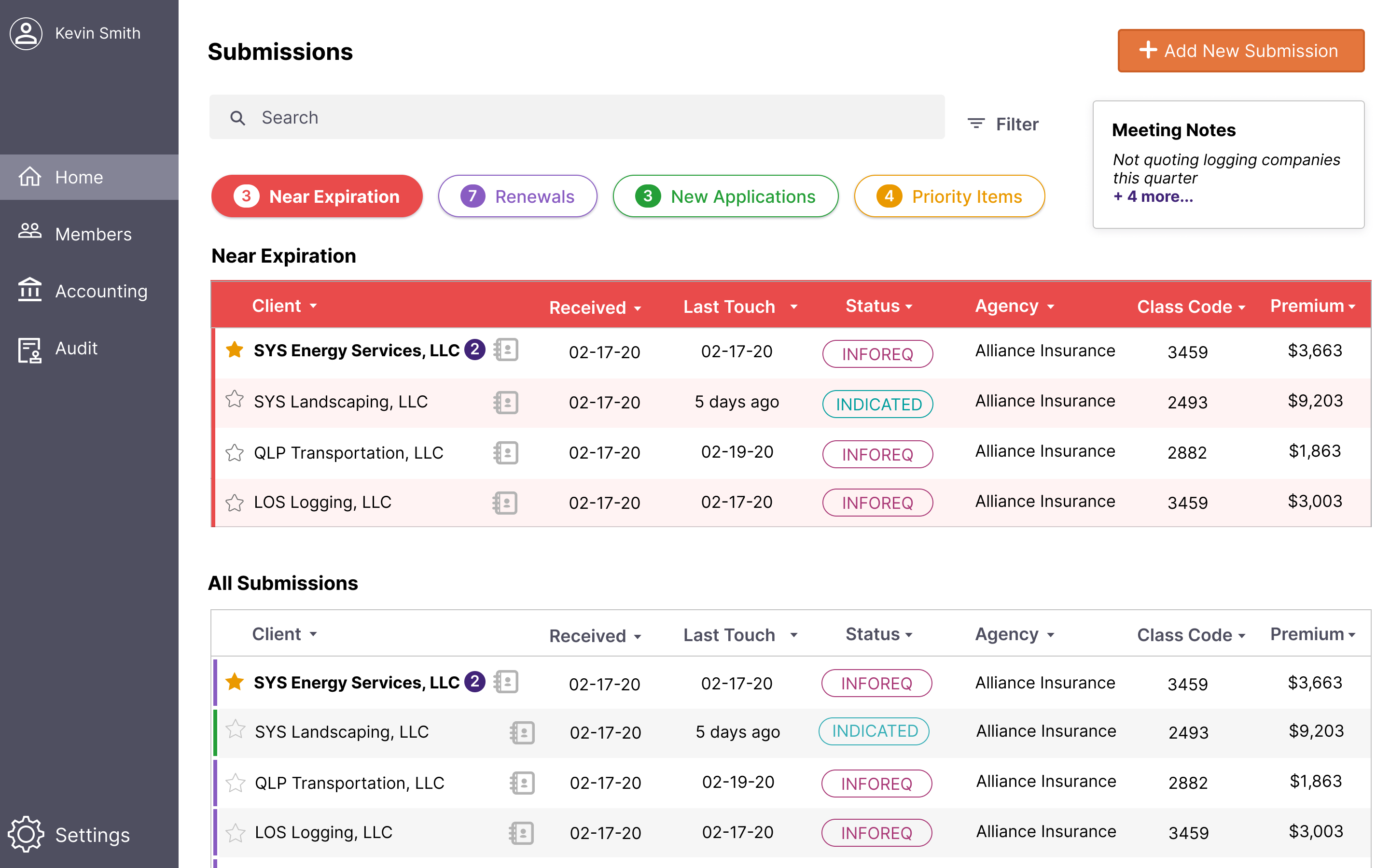
Based on the client presentation, we knew that a major part of underwriters' job that was missing from FundOps was a way to easily see the submissions that needed attention right away. Underwriters were relying on a daily email report to organize their submissions. This dashboard allows underwriters to quickly scan through submissions, and use quick shortcuts at the top to filter submissions, such as those nearing expiration. I designed the filtering, as well as the table design.
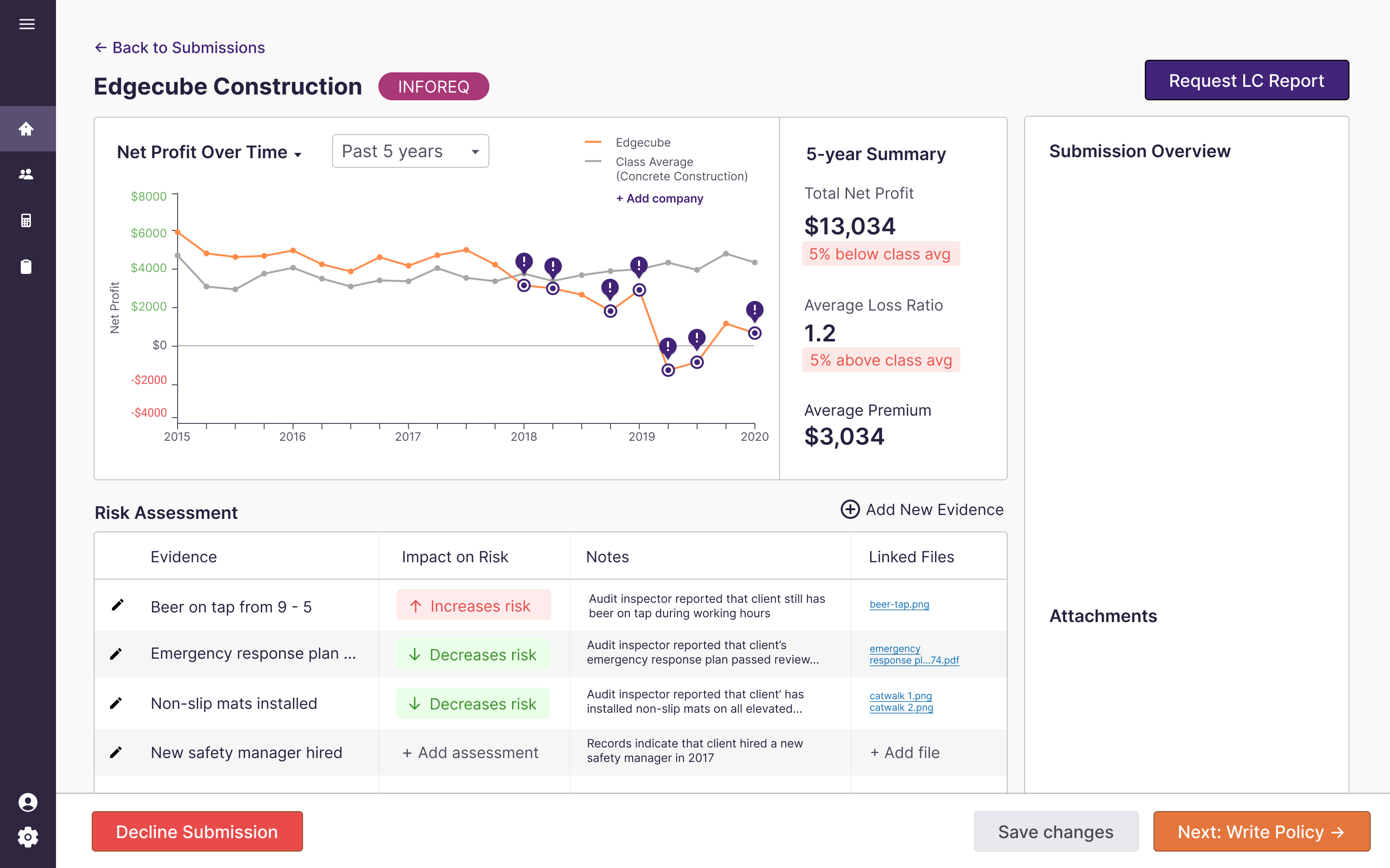
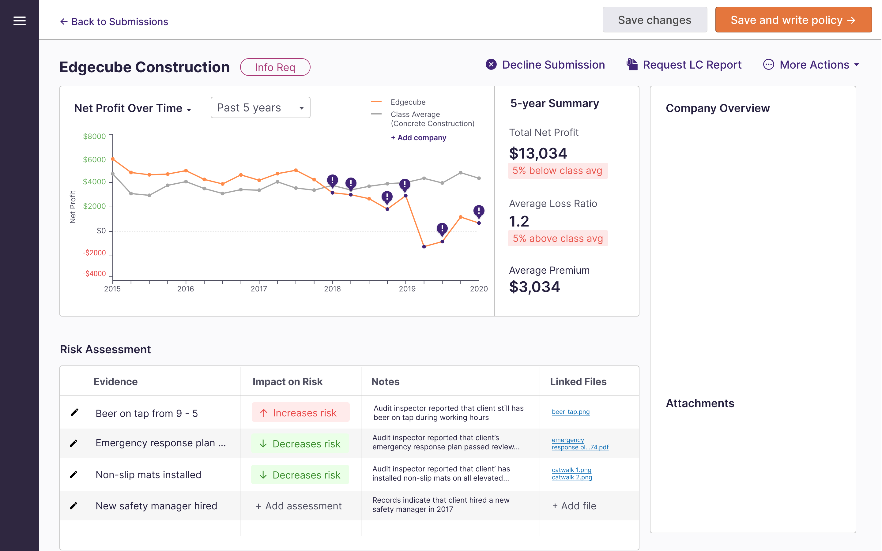
I designed most of the final design for this screen, based on our discovery that underwriters spent a lot of their day just doing administrative work rather than carefully analyzing submissions. The interactive graph allows underwriters to pinpoint where major losses have occurred while assessing the company's performance over time, relative to other companies in their industry.
In addition to using loss ratio data, underwriters rely on audit inspectors to write Loss Control Reports on companies. They use these reports to further evaluate risk. We added a Risk Assessment section to allow underwriters to log qualitative evidence that might impact their decision of whether or not to quote a policy for a company.
%20(2).png)
In order to break down the policy writing sections, as well as give underwriters the ability to see the effect of their changes in real time, I designed this page to have form input on the left, and output on the right. The sliders allow for easy changes that can still be fine tuned, so underwriters can see how changes in these values affect the profitability shown on the right. Each section also shows the total value at the top, so the underwriter can easily preview the amounts.
The underwriter we interviewed stated that he spent a lot of time just doing data entry, entering the applications he receives into the FundOps system. This redesign would use technology to read the PDFs and auto-fill the applications. I designed this screen, and made sure to allow room for error, by including form validation and requiring human confirmation of the information.
This was the first time I worked on a design for a client, so I learned a lot about designing for unfamiliar domains. Worker's compensation insurance underwriting is an extremely complex and specialized field, but it's essential for many companies. I learned about working with the client and asking as many questions as possible. I also knew it was essential that we involved the users, so I advocated for a way for us to talk to an insurance underwriter at LCI.
Additionally, I learned a lot about collaboration. The COVID-19 pandemic began when we were a few weeks into our project, so we had to find a way to collaborate given the unexpected events. Overall, although the problem was challenging and unfamiliar, my team and I really enjoyed creating an innovative, unique redesign that kept the user's needs in mind.
If I could do it differently or if the circumstances had been different, here's what I would have done: